Product Page Optimization: Turn Browsers Into Buyers
Most online stores lose the sale on the product page. A shopper clicks through from search or social media, lands on the product, hesitates — and leaves. The difference between a product page that converts and one that does not usually comes down to a handful of specific elements: photography, copy, trust signals, and how easy it is to buy. This product page optimization guide breaks down exactly what to fix, in priority order, so your pages start turning more browsers into buyers.
Product Page Optimization Starts With Photography
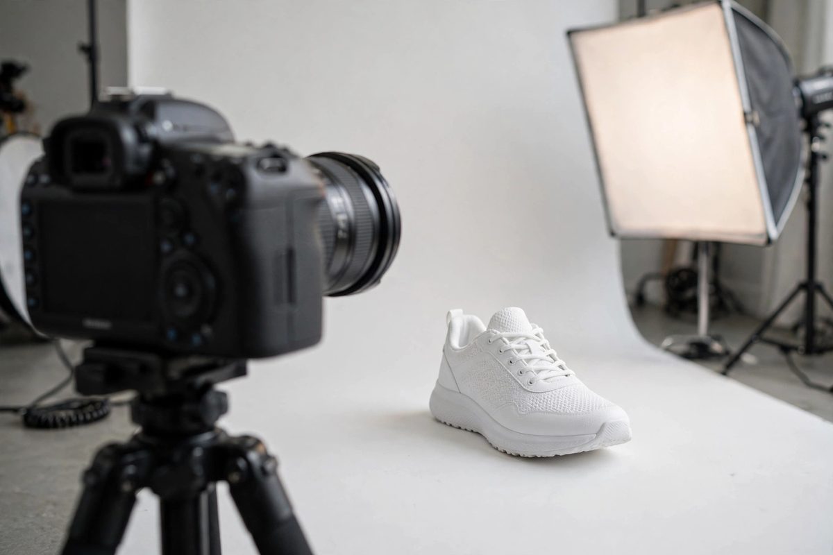
Online shoppers cannot touch your product, so your photos have to do that job. The single biggest upgrade most stores can make is adding more images: show the product from every angle, show it in use, show it next to familiar objects for scale, and show close-ups of materials and details. A product with one flat photo on a white background forces the shopper to guess — and guessing kills conversions.
Lifestyle photos matter as much as studio shots. A candle photographed in a cozy living room sells the feeling, not just the object. If you sell clothing, show it on real people in different sizes. If you sell tools or gear, show them being used. Aim for at least five images per product, and make sure the first image — the thumbnail shoppers see everywhere — is your strongest one. For a deeper dive, see our guide on how to choose product photos that increase sales.
Write Copy That Sells Benefits, Not Just Features
Most product descriptions read like spec sheets: dimensions, materials, colors. Those details matter, but they do not persuade. Persuasion comes from benefits — what the product does for the buyer. Instead of "100% cotton, 220 GSM," try "thick, breathable cotton that keeps its shape wash after wash." Same facts, completely different impact.
Structure your copy so it is easy to scan. Lead with a short paragraph that captures the main benefit, then use bullet points for key details, and finish with practical information like sizing, care, or compatibility. Most shoppers skim — make sure the important points survive a five-second scan. Our full framework for writing product descriptions that sell covers this in detail.
- →Open with the biggest benefit, not the product name or a generic greeting.
- →Use bullet points for specs so scanners can find details fast.
- →Address the top objection directly — fit, quality, compatibility, or shipping time.

Make the Buy Button Impossible to Miss
The add-to-cart button is the most important element on the page, yet many stores bury it below long descriptions or style it so subtly it blends in. Your buy button should be large, high-contrast against the page background, and visible without scrolling on both desktop and mobile. The price should sit right next to it — never make shoppers hunt for the price.
On mobile, consider a sticky add-to-cart bar that stays visible as the shopper scrolls through photos and reviews. Mobile shoppers scroll a lot, and every scroll past the buy button is a chance to lose them. A persistent button removes that risk.
Add Trust Signals Near the Decision Point
First-time buyers are taking a risk on you. Reduce that perceived risk with trust signals placed close to the buy button: customer reviews with star ratings, a clear return policy ("30-day hassle-free returns"), secure checkout badges, and shipping time estimates. Reviews deserve special attention — products with reviews convert significantly better than those without, so actively ask buyers to leave them after delivery.
Answer common questions directly on the page instead of hiding them in a FAQ. A short "shipping & returns" accordion right under the buy button resolves last-minute doubts at exactly the moment they arise.
Remove Friction and Distraction
Every extra click, popup, or confusing element on a product page costs you sales. Audit your pages for friction: do variant selectors (size, color) work clearly? Is the quantity selector obvious? Are there popups blocking the buy button on mobile? Does the page load in under three seconds? A slow product page is a silent conversion killer — compress your images and test your speed regularly.
Finally, test one change at a time. Change the main photo, wait for meaningful traffic, and compare conversion rates before changing the headline. Small, measured improvements compound — a page converting at 1% that moves to 2% has doubled its revenue without a single extra visitor. If your product pages need a professional overhaul, a consultation with an e-commerce specialist can identify the highest-impact fixes for your specific store.
Frequently Asked Questions
What is product page optimization?
Product page optimization is the process of improving every element of a product page — photos, copy, layout, trust signals, and checkout flow — to convert a higher percentage of visitors into buyers.
How many images should a product page have?
Aim for at least five: a strong hero shot, alternate angles, lifestyle photos showing the product in use, close-ups of details and materials, and a scale reference. More quality images consistently lift conversion.
Do product reviews really increase sales?
Yes. Products with visible reviews and star ratings convert significantly better than those without, because reviews reduce the perceived risk of buying from an unfamiliar store. Actively request reviews after delivery.
What is a good conversion rate for a product page?
It varies by industry, but most small e-commerce stores see 1–3% of product page visitors purchase. Doubling a 1% rate to 2% doubles revenue from the same traffic — which is why optimization beats chasing more visitors.

Muhammad Usman designs and builds high-converting websites for small businesses — and writes practical guides like this one from real project experience.
Keep Reading

How to Reduce Shopping Cart Abandonment

How to Start an Online Store in 2026: Step-by-Step

Payment Gateways Compared for Small Online Stores
Need a Website That Actually Performs?
Fixed pricing, professional build, live in weeks. Tell us about your project — free strategy call, no pressure.